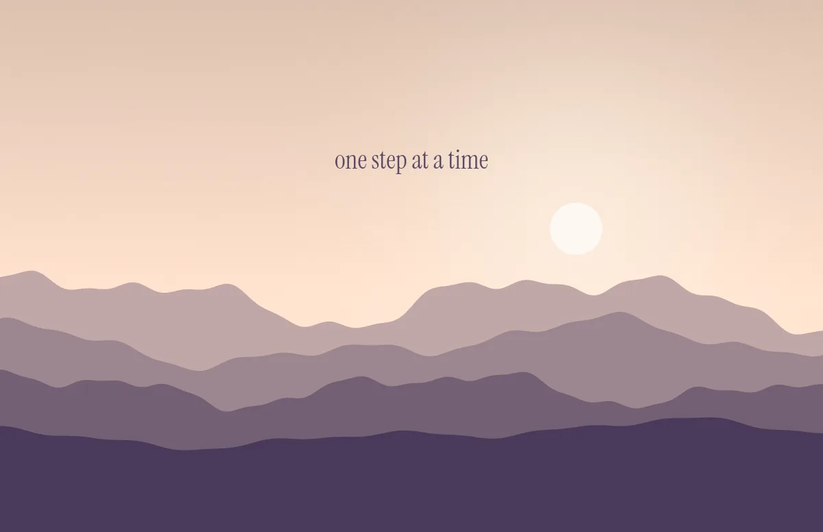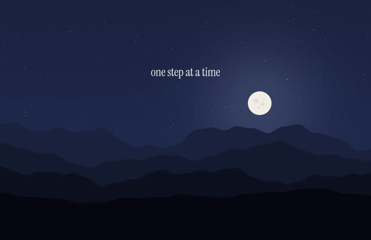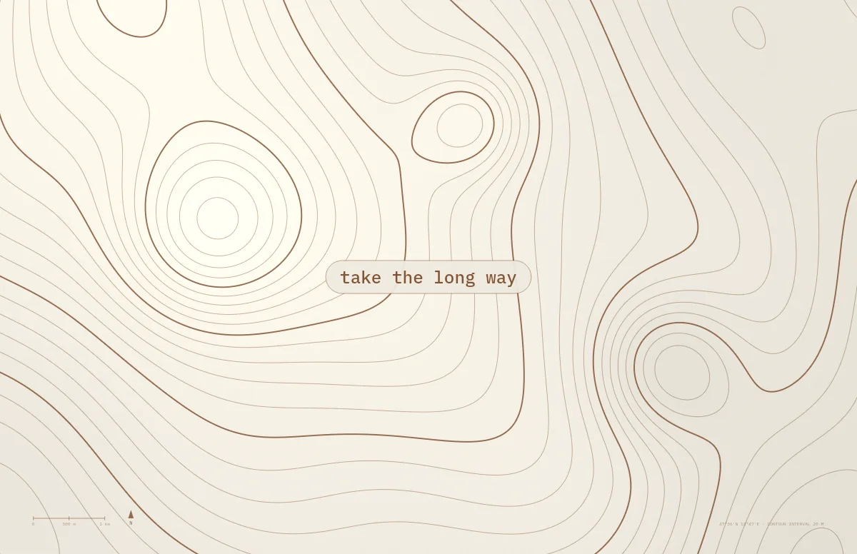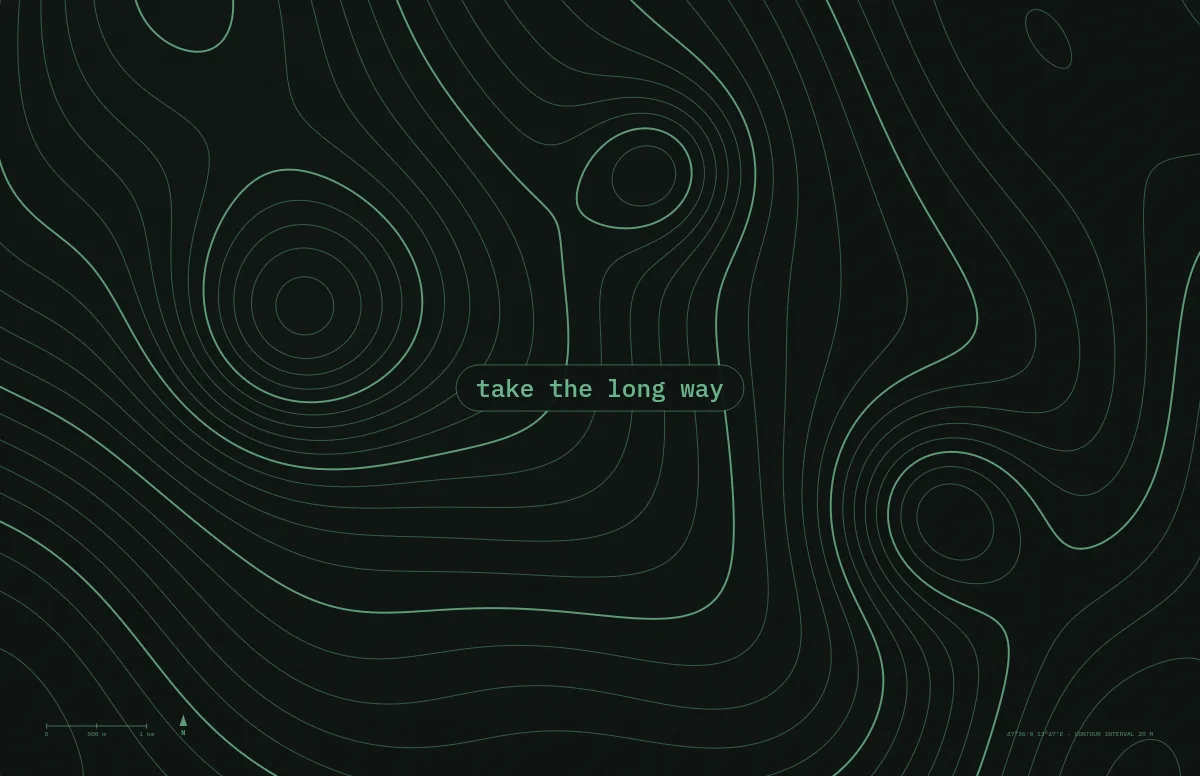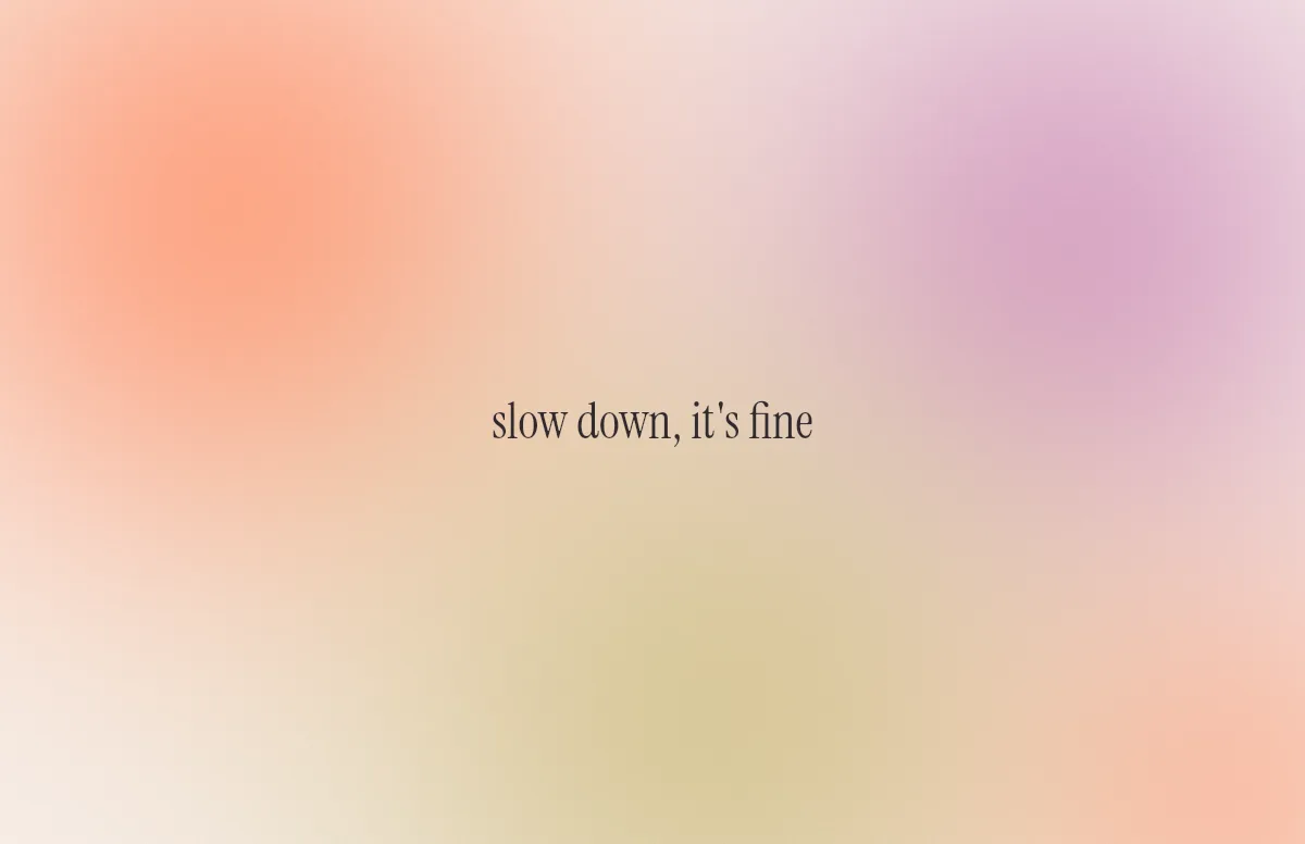
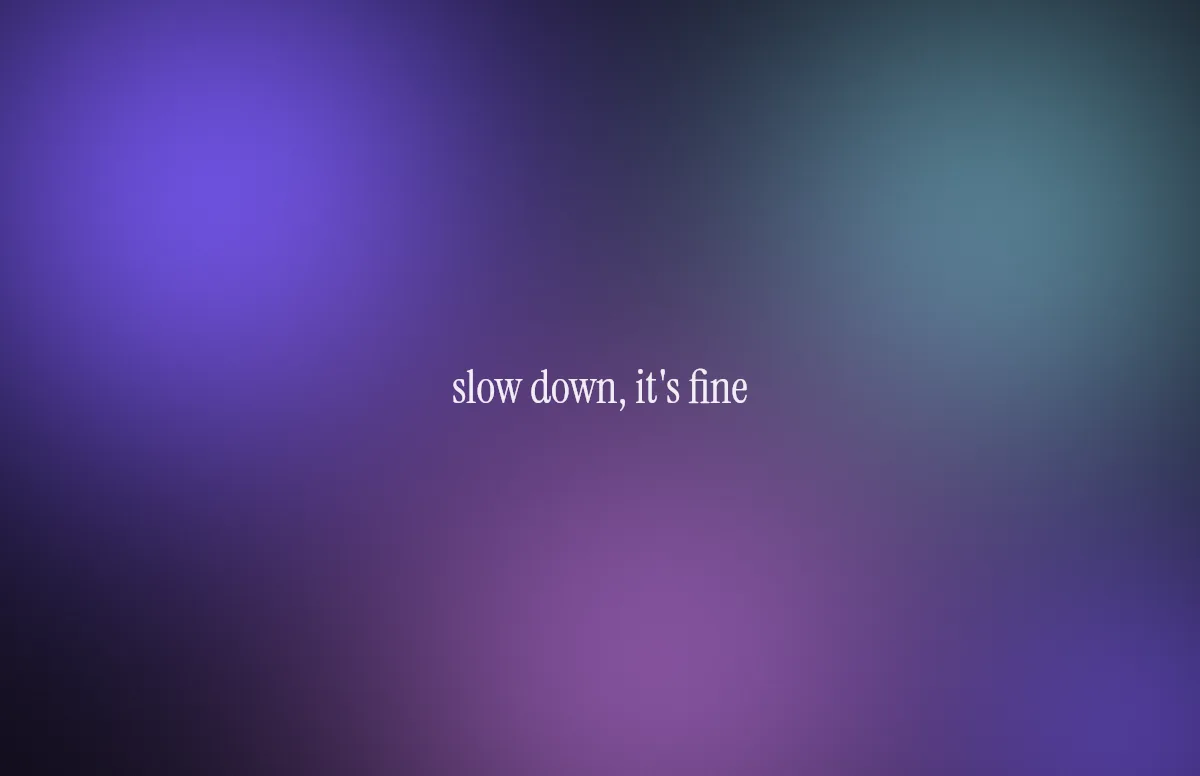
A light/dark wallpaper switches at least twice a day. If the two versions do not feel related, the switch looks like a different wallpaper took over. If they do, it feels like the same room with the lights dimmed. A few rules get you there.
1. Keep one color constant
The easiest way to tie both versions together is to keep one color the same and change the other. Keep the accent, swap the background: red on cream by day, red on near-black at night. The Bauhaus template takes the idea further: each version uses a single color in three strengths.
2. Change brightness more than hue
Move the background from light to dark, but stay in the same color family. A warm sand turns into a warm brown-black, a cool fog into a deep blue-grey. Jumping from warm to cool at the same time makes the switch feel abrupt.
3. Lower the contrast at night
A dark wallpaper does not need full white lines. Lines and text at around 70 to 85 percent brightness are easier on the eyes in the evening and still read well. Most dark presets in the generator use a soft off-white or a muted accent for that reason.
4. Avoid pure black and pure white
Pure white is harsh during the day, and pure black hides any texture at night. A slightly tinted off-white and an almost-black with a hint of color look calmer and keep fine details like grain or grid lines visible.
5. Test both next to your windows
Your wallpaper is mostly seen behind windows and app icons. Check the light version with a white Finder window over it and the dark version with a dark one. If the edges of the windows disappear into the background, add a little more contrast.
Combinations to start from
| Style | Light | Dark |
|---|---|---|
| Workshop | sand with dark brown lines | ink black with soft grey lines |
| Drafting | pale blue paper with blue ink | deep blueprint blue with white lines |
| Calm | peach glow on cream | violet glow on near-black |
| Developer | paper white with black text | dark green-black with phosphor green |
| Poster | cream with signal red | black with warm yellow |
Every template in the generator comes with six light and six dark presets built on these rules, and you can fine-tune each color. The Aura template is a good place to try, because its soft gradients show quickly whether a pair works. On an OLED iPhone or the PROLED MacBook Pro, near-black dark versions look especially deep; more on that in OLED wallpaper: true black, battery and burn-in.